Custom Ink Rebrand Illustration
Making it magical
When communicating Belonging, we believe that photography will forever lead the way. Whether it’s the authenticity of a family’s embrace, the emotion of a game winning goal, the craft of pulling the perfect screen, or the tactile tooth of our newest product... it’s a brilliant photo that gets us there. In the same way, Illustration is critical when we need to quickly communicate something more abstract, tell a story that is figurative instead of literal, or transform the mundane into the magical.
With Illustration we can do more than write copy about Inspiration, we can actually begin to show it. We ask our customers to create custom works of art, illustration allows us to show them how with our own artwork. What was once a shipping box isolated on a white background becomes an Inky Box parachuting from the sky to settle safely on a customer’s doorstep.

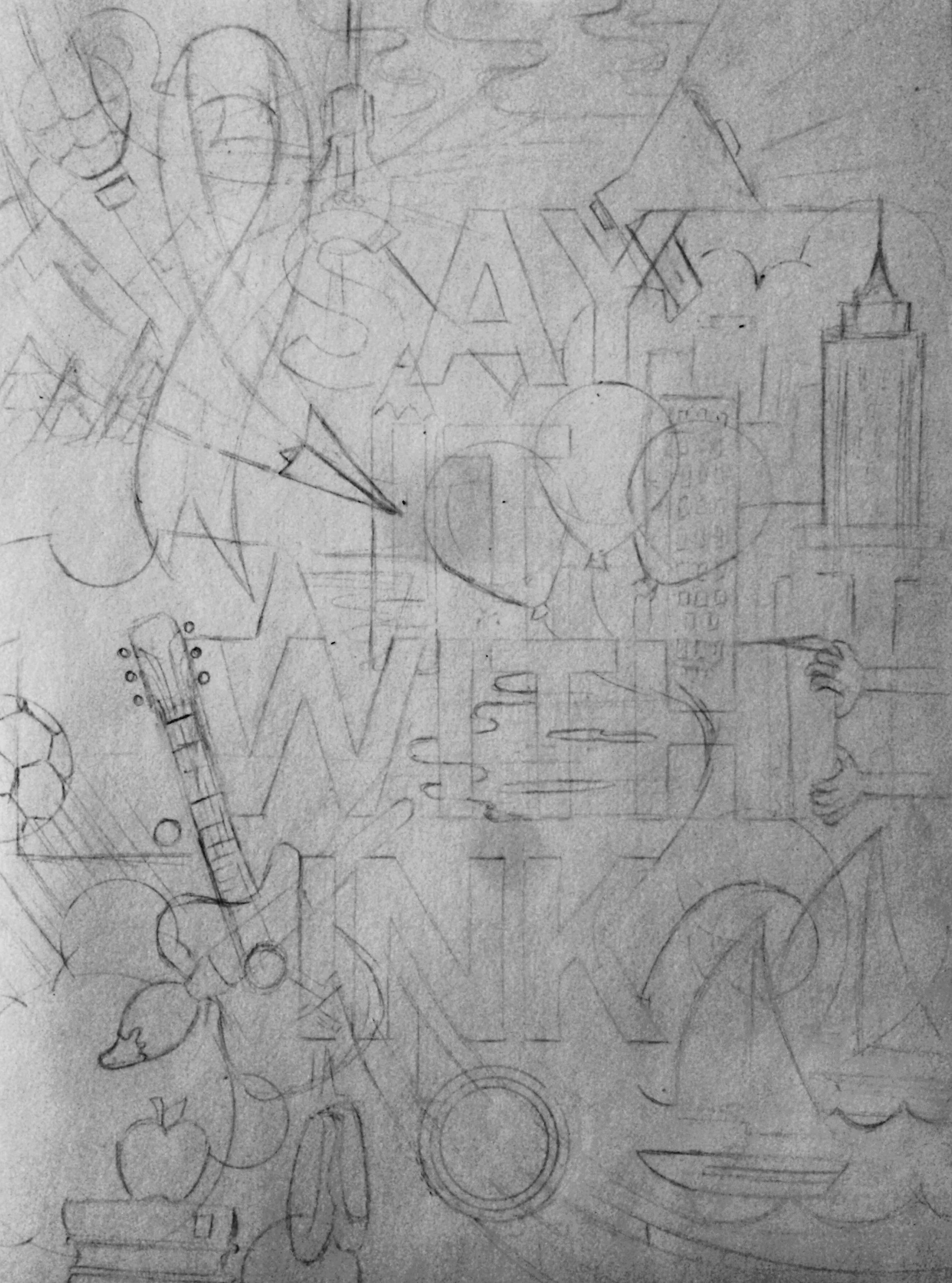
It all started with a sketch
We started sketching some imagery from the brainstorming session. We started thinking about visual metaphor and what that could mean for illustration. Clarity and legibility being important, we opted for more simple solution, rather than complicated narratives.
We tried everything, from bold line, to texture, to dual tones, to extremely flat. As we explored a variety of styles, every iteration led us to new conclusions about what we did and did not want for our brand. We want it to be bold, we want it to be playful, we want it to be clear and legible.


The power of negative space
After all of the sketching, exploration, and the competitive analysis, we went back to the beginning of it all, back to the heart of our brand. Inky represents who we are and since he is an illustration himself, we figured we could learn a few things. We kept coming back to the fact that inky is flat, geometric, and created using negative space in a fun and interesting way. With our new illustration style, we want to incorporate those key inky descriptors to inform our final illustrations. We believe that it is vital to our brand and to our site, that our illustration style hold the integrity of who we are.

Starting to pan out
Here you can see the spot illustrations at work on the homepage. The idea is that they would live in harmony with the rest of the brand. Ideally they would all include our signature red, and would only include 2 of our brand colors at a time, with tints and shades.

Looking Forward
By embracing this new style, we can use illustration like we’ve never done before. We can use it on business cards, murals, stickers, conference rooms, retail stores (area specific), mailers, digital banner ads; the possibilities are endless. By creating assets like this, we build in an illustration system at which designers can use the illustration as a whole, or use bits and pieces to create new spot illustrations.
